Q2. what was your hardest graphic update that took forever to make
q3. what was your fav graphic update project u made for rs
q4. what can we see in the future that will make rs even better
A)
1: Im afraid i dont know mate, not my call. I just work here
2: Many of the old areas that need updating can be tricky to rework, because we cant change the blocking or layout of the area or it will interfere or change the way the game would play. I had that with Casltewars. I would have loved to tear up Castlewars are redo it from scratch with a new layout but was restricted.
3: I worked on God Wars main boss chamber, and really enjoyed it, and still think it looks ace.
4: With the help of HTML5 we should be able to visualize bigger grander landscapes.
Q) ...........How much do you get paid? (lol) JK JK.
A) hahahahaaaaa its a secret
Q) I always wanted to know the process in which these projects are accepted then put into action. How does an idea gets to become part of the game?
A) This is more of a design question than an art one, but translating it, once an idea has been thought up, its discussed with the concept team who take what the designers want and dream up the world, the characters and everything else. They sketch out pictures, designs, plans whilst discussing how things will work with the various teams such as content the art and whoever else needs to be involved.
After this its all approved by the heads, such as mod_mark and the art director mod_whalefis and then its good to go when its time is right!
Q) How is the typical day for the Jagex art team? Do you enjoy yourself? Is it sometimes frustrating? Do you go home exhausted?
A) A typical day would be to arrive and pick up from where we left off the evening before. The work is great! We get to model and draw and do all sorts of stuff each day. Working on a fantasy game gives us far more variety in work than say a more conventional style game where things need to be more realistic (not to belittle their work). I rarely go home feeling tired, but that could be just my youth
Other Questions:
Q) ---- While we can wear masks and cosmetic overrides to change the appearance of our player, I wondering if it would be possible to add varying body shapes and avatar appearances? (e.g fatter characters, shorter characters, etc.)
A) This is something that could be considered, but isn't yet being talked about. We do try to add variety of scale more to our NPCS these days so were making a start.
Q) ---- It's great that you're updating a whole lot of things in the games especially graphically, but don't you think that the graphics in the POH are a little out-dated? Last time I was working there, the old 2007 Runescape interface pops up whenever I play games. The trees are classic, and above all....there is no sky or background which looks...strange. Are there any plan to upgrade those graphics?
A) The POH are very out of date, they were added back in 2006? It would be very nice to someday update them, but there's nothing to confirm about it. There will be skyboxes and backgrounds available in HTML5!
Q) ---- Why aren't Cosmetic Overrides allowed in PvP areas?
A) This is probably a design choice to make it so that people cannot disguise what they're wearing when they're about to attack someone.
Q) ---- What are the future updates we should be aware of?
A) Check our behind the scenes. Lots of info in there!
This is certainly
FAR
better than my first digital drawing using a tablet! Mine was appalling....
The overall style of the picture is nice. I like how you've added in highlights from a light source (or multiple?), however as a result, it gets confusing in some places. For example, you have shadow being cast from a top down light direction, yet from what I can tell the light source is better described from the base upwards (all the sparkles).
To improve this you could try defining strictly where the light is coming from, or removing the sparkles.
Secondly you could brighten the background. I understand why people jump to black or white, but in fact it makes drawing images more tricky and and confusing lighting further. Try a more subtle colour, such as a grey or a desaturated blue. Or something that compliments the scene and is easier on the eyes.
Finally, if you do a little research into Ambient Occlusion, this would help the shadowing and shading further and define how light reflects off shiny things such as the armour and skin! There is plenty of information online
Besides that, its a great attempt and I look forward to seeing more of your work on our DA in the future
Keep posting up WIP's and we'll reply if we can
(Q) It doesn't look like you will have time to answer this one, but I'll ask on the off chance you get a few extra minutes. This is further to my other question regarding Saradomin which was very kindly answered.
There was a previous version of Saradomin in-game, though the concept art that I have seen is newer and I must say looks much more like I would expect Saradomin to look. However, what made you decide to re-design him? It's a lot of trouble to go to, to re-concept, redesign, remodel and reanimate a character, so somebody must have felt strongly about it. I would be very interested to know, if there's time to answer.
(A) So very quickly, if we`re updating an area or a quest we look at all the characters involved and if we need to update them. Every character gets his/her chance to have his/her say and if we feel it's important enough were give them a make over.
I think this is a fantastic piece of work, there's a lot of character to it, the shading is great and brings out the shape of the clothes well. I like how you didn't jump to using black to darken up the image and used darker, more saturated versions of the colour to give the imagine volume.
The grey behind also works well as it doesn't cause the contrast to look so stark.
My main critique would be that you've give the character a large blue fireball, but its casting no light! You could take what you've currently done and do a blue pass where the flames are blowing out colour and warmth! that would add just a little bit more to the picture!
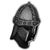
Great work here Xephix, looks like you've spent quite a bit of time getting the black and white balance just right and adding the detail in all the right places. I'm loving evil looking helm and that one dark eye looking out at you, creepy awesome stuff!
I would love to see a little more color in the background to really make the wizard pop out. Think about subtlety mixing colors like you have the red and grey on the top of his helm that's working really well and is one of my favorite parts of your art work.
You've got a real creative flare, keep up the good work.
(Q) I guess it is almost time to reveal some things of my new RuneScape movie called "The Rapture". It's a short movie featuring angels and demons fighting in a war between Heaven and Hell.
I wrote a short-story as well, you can find it somewhere on my Devianart page.
But what do you guys think? Should it be more dark, or is the light good enough?
(A) Thanks for the image DenJento, it looking great and we can't wait to see movie you've been working on.
Front cover is looking awsome, I wouldn't change the lighting on it but maybe you could balance the right lower side of the image with a little more fire to show the conflict between the two sides. Be careful you don't lose the demon though.
The logo has plenty of space to breath and although the sun is pretty bright it doesn't get lost within the image. The angel in the lower left corner has a great magical glow going on on his wings, see if you can pick up some of the high lights of the character using this light so he's not lost in lens flare.